
![]()

![]()
You can create new reports and add them to your dashboard.
To create new reports:
Select Reports > Select the Module > New Report icon ![]() . The following page is displayed.
. The following page is displayed.

The following tabs are available using which you can configure the report the way you want:


 DATA SOURCES
Under the DATA SOURCES tab, you can view the list of configured Data Sources for each module using which you can create the related report. Each Data Source is based on an Instance Category. You can view two types of Data Source tables:
To create a report, select the check box of the related Data Source, and then click CONTINUE TO FIELDS.

Figure: DATA SOURCES tab
The following table describes the fields under the DATA SOURCES tab:
| Field | Description | ||||||||||||||||||||||||
| Recent Data Sources | Lists all the recent Data Sources that you selected for creating reports. | ||||||||||||||||||||||||
| ADVANCED | Click the button to select the advance mode of report creation.   See Screen shot. See Screen shot.
In the ADVANCED mode, you can select the relationship that exists between two fields and join them to create a report. The fields must have similar primary or foreign keys to join them.
Select the Data Source from the Data Sources (Tables and Views) drop-down list, and click the
Figure: DATA SOURCES tab: ADVANCED mode
Select the appropriate data from the drop-down lists and click CONTINUE TO FIELDS.
Figure: DATA SOURCES tab: ADVANCED mode: Joining Fields
The following table describes the fields under the DATA SOURCES tab.
|
||||||||||||||||||||||||
| CONTINUE TO FIELDS | Click the button to access the FIELDS tab. |


 FIELDS
Under the FIELDS tab, you can select the fields that you want to show in the report.

Figure: FIELDS tab
The following table describes the fields under the FIELDS tab.
| Field | Description | ||||||||||||||||||||||||||||||||||||||||||||||||
| Report Designer's Toolbar | Enables you to perform various functions on the reports, such as, create, save, print, e-mail, export and so on.   See Screen Shot. See Screen Shot.
Figure: Report Designer's Toolbar
The following table describes the icons on the Report Designer's Toolbar:
|
||||||||||||||||||||||||||||||||||||||||||||||||
| Records | Specify the number of records that you want to display in your report. | ||||||||||||||||||||||||||||||||||||||||||||||||
| Field | Lists the configured fields related to the category that you selected under DATA SOURCES tab. From the drop-down list, select the field that you want to view in the report. | ||||||||||||||||||||||||||||||||||||||||||||||||
| Description | Displays a new title for the field that you added. | ||||||||||||||||||||||||||||||||||||||||||||||||
| Sort | Select the check box to sort the fields from A to Z. | ||||||||||||||||||||||||||||||||||||||||||||||||
| VG | Select the check box to view the field in a group. | ||||||||||||||||||||||||||||||||||||||||||||||||
| A | Select the box to perform calculations, such as +, -, x, % and so on. | ||||||||||||||||||||||||||||||||||||||||||||||||
| Function |
Lists the configured functions that are based on the type of data that you access. The functions enable you to perform calculations on the data. There are three types of functions that can be available based on the Data Source you selected:
For more information about the functions,
From the drop-down list, select the appropriate function. |
||||||||||||||||||||||||||||||||||||||||||||||||
| Format | Lists the configured formats to display the data. There are three types of functions that can be available based on the data source you selected:
  See Description. From the drop-down list, select the Format in which you want to view the data. See Description. From the drop-down list, select the Format in which you want to view the data.
|
||||||||||||||||||||||||||||||||||||||||||||||||
 |
Click the Delete icon to remove the selected field. | ||||||||||||||||||||||||||||||||||||||||||||||||
 |
Click the Insert Field Above icon to insert a new field above the selected field. | ||||||||||||||||||||||||||||||||||||||||||||||||
 |
Click the Insert Field Below icon to insert a new field below the selected field. | ||||||||||||||||||||||||||||||||||||||||||||||||
 |
Click the Advanced Field Settings icon to set advance settings related to the field.   See Screen Shot. See Screen Shot.
The following table describes the fields on this page:
|
||||||||||||||||||||||||||||||||||||||||||||||||
 |
Drag this icon to change the field order. | ||||||||||||||||||||||||||||||||||||||||||||||||
| Add Subtotals | Select the check box to view total count under each numeric column. | ||||||||||||||||||||||||||||||||||||||||||||||||
| Hide Grid | Select the check box to hide the report. | ||||||||||||||||||||||||||||||||||||||||||||||||
| QUICK ADD | Click the button to quickly add multiple fields to the report at the same time.   See Screen Shot. See Screen Shot.
On this pop-up page, select the fields that you want to add in your report, and then click OK.
|
||||||||||||||||||||||||||||||||||||||||||||||||
| ADD PIVOT | Click this button to generate a pivot report along with the tabular report.   See Screen Shot. See Screen Shot.
|
||||||||||||||||||||||||||||||||||||||||||||||||
| REMOVE ALL | Click this button to remove the field values. | ||||||||||||||||||||||||||||||||||||||||||||||||
| DESIGN FORM | Click this button to design a form.   See Screen Shot. See Screen Shot.
|
||||||||||||||||||||||||||||||||||||||||||||||||
| CONTINUE TO SUMMARY | Click this button to access the SUMMARY tab. | ||||||||||||||||||||||||||||||||||||||||||||||||
| PREVIEW | Click this button to get a preview of the report that you designed. |

 SUMMARY
Under the SUMMARY tab, you can create a table that summarizes the fields you have selected using different functions, such as Average, Count, Maximum, and so on. You can also make a group of fields by choosing the Group option from the Function drop-down list.

Figure: SUMMARY tab
The following table describes the fields under the SUMMARY tab:
| Field | Description | ||||||||||||||||||||||||||||||||||||||||||||||||
| Report Designer's Toolbar | Enables you to perform various functions on the reports, such as, create, save, print, e-mail, export and so on.   See Screen Shot. See Screen Shot.
The following table describes the icons on the toolbar:
|
||||||||||||||||||||||||||||||||||||||||||||||||
| Title | Specify the title of the report. | ||||||||||||||||||||||||||||||||||||||||||||||||
| Records | Specify the number of records that you want to display in your report. | ||||||||||||||||||||||||||||||||||||||||||||||||
| Field | Lists the configured fields related to the Data Sources that you selected under DATA SOURCES tab. From the drop-down list, select the field that you want to view in the report. | ||||||||||||||||||||||||||||||||||||||||||||||||
| Description | Displays a new title for the field that you added. | ||||||||||||||||||||||||||||||||||||||||||||||||
| Sort | Select the check box to sort the fields from A to Z. | ||||||||||||||||||||||||||||||||||||||||||||||||
| VG | Select the check box to view the field in a group. | ||||||||||||||||||||||||||||||||||||||||||||||||
| A | Select the box to perform calculations such as +, -, x, % and so on. | ||||||||||||||||||||||||||||||||||||||||||||||||
| Function |
Lists the configured functions that are based on the type of data that you access. From the drop-down list, select the appropriate function. |
||||||||||||||||||||||||||||||||||||||||||||||||
| Format | Lists the configured formats to display the data. From the drop-down list, select the Format in which you want to view the data. | ||||||||||||||||||||||||||||||||||||||||||||||||
 |
Click the Delete icon to remove the selected field. | ||||||||||||||||||||||||||||||||||||||||||||||||
 |
Click the Insert Field Above icon to insert a new field above the selected field. | ||||||||||||||||||||||||||||||||||||||||||||||||
 |
Click the Insert Field Below icon to insert a new field below the selected field. | ||||||||||||||||||||||||||||||||||||||||||||||||
 |
Click the Advanced Field Settings icon to set advance settings related to the field.   See Screen Shot. See Screen Shot.
The following table describes the fields on this page:
|
||||||||||||||||||||||||||||||||||||||||||||||||
 |
Drag this icon to change the field order. | ||||||||||||||||||||||||||||||||||||||||||||||||
| Add Subtotals | Select the check box to view total count under each numeric column. | ||||||||||||||||||||||||||||||||||||||||||||||||
| Add Deltas | Select the check box to display the change in a quantity with respect to the original quantity. In the report, the change in quantity is displayed in parenthesis. | ||||||||||||||||||||||||||||||||||||||||||||||||
| Hide Grid | Select the check box to hide the summary report. | ||||||||||||||||||||||||||||||||||||||||||||||||
| CONTINUE TO CHART | Click this button to access the CHART tab. | ||||||||||||||||||||||||||||||||||||||||||||||||
| PREVIEW | Click this button to get a preview of the report that you designed. |

 CHART
CHART
Under the CHART tab, you can create charts by using the data that you selected under the DATA SOURCES tab and add them to your report.

Figure: CHART tab
Select the chart type from the Chart Type drop-down list:

 Trend
Trend
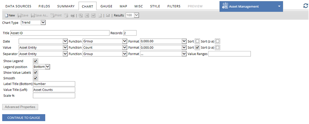
Figure: Trend Chart
The following table describes the fields on the Trend Chart:
| Field | Description |
| Title | Enter a title for the chart. The title is displayed above the chart. |
| Records | Enter the maximum number of records that you want to include in the chart. |
| Function |
Lists the configured functions that are based on the type of data that you access. From the drop-down list, select the appropriate function. |
| Format |
Lists the configured formats to display the data. From the drop-down list, select the Format in which you want to view the data. |
| Date | Select the time metric for the chart. The options for the fields appear as per the Data Source that you select. |
| Sort | Select the check box to sort the fields from A to Z. |
| Sort (z-a) | Select the check box to sort the fields in descending order. |
| Value | Select a field from the drop-down list, to use its data on Y-axis of the chart. |
| Advanced Properties | |
| Separator | Select a field from the drop-down list, to separate the data in multiple groups. |
| Show Legend | Check the check box to display the values given with Separator field, as legends below the chart. The color of the legends are same as the color shown in the Trend chart. |
| Legend position | Select the position of the legends from the drop-down list. You can position the legends to the left, right, bottom or top of the chart. |
| Show Value Labels | Check the check box to show the value at each increment on the chart. |
| Smooth | Check this check box to show the data in smooth curves on the chart instead of straight lines. |
| Label Title (Bottom) | Enter a label name for the bottom section of the chart. |
| Value Title (Left) | Enter a label name for the left section of the chart. The data displayed on the left margin, describes the position of the bars. |
| Scale % | Enter the percentage to scale the Trend chart. The size of the chart is displayed as per the percentage that you specify. If you do not specify a percentage, by default, the scale size is selected to 100%. |

 Bar
Bar
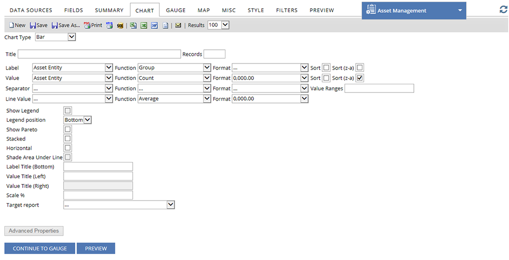
Figure: Bar Chart
The following table describes the fields in the Bar Chart:
| Field | Description |
| Title | Enter a title for the chart. The title is displayed above the chart. |
| Records | Enter the maximum number of records that you want to include in the chart. |
| Label | Select a field from the drop-down list, to use its data in X-axis of the chart. |
| Function |
Lists the configured functions that are based on the type of data that you access. From the drop-down list, select the appropriate function. |
| Format |
Lists the configured formats to display the data. From the drop-down list, select the Format in which you want to view the data. |
| Sort | Select the check box to sort the fields from A to Z. |
| Sort (z-a) | Select the check box to sort the fields in descending order. |
| Value | Select a field from the drop-down list, to use its data in Y-axis of the chart. |
| Advanced Properties | |
| Separator | Select a field from the drop-down list, to separate the data in multiple groups. |
| Line value | If Show Pareto check box is selected,this will set an alternate metric to display on the trend line |
| Show Legend | Check the check box to display the values given with Separator field, as legends below the chart. The color of the legends are same as the color shown in the Bar chart. |
| Legend position | Select the position of the legends from the drop-down list. You can position the legends to the left, right, bottom or top of the chart. |
| Show Pareto | Select the check box to superimpose a Trend chart on the Bar chart. |
| Stacked | Check this check box to show the bars in stacks, if they are in same group. |
| Horizontal | Select the check box to rotate the bars 90 degrees. The bars will originate from the left (Y-axis) and will be parallel to the X-axis. |
| Shade Area Under Line | Select the check box to make the area under trend line, semi-transparent. |
| Label Title (Bottom) | Enter a label name for the bottom section of the chart. |
| Value Title (Left) | Enter a label name for the left section of the chart. The data displayed on the left margin, describes the position of the bars. |
| Value Title (Right) | Enter a label name for the right section of the chart. The data displayed on the left margin, describes the trend line. |
| Scale % | Enter the percentage to scale the bar charts. The size of the bars are displayed as per the percentage that you specify. If you do not specify a percentage, by default, the scale size is selected to 100%. |
| Target Report | Select the subreport from the drop-down list that you want to show on the bar chart. |
| CONTINUE TO GAUGE | Click the button to access the GAUGE tab. |
| PREVIEW | Click the button to preview the bar chart that you designed. |

 Pie
Pie
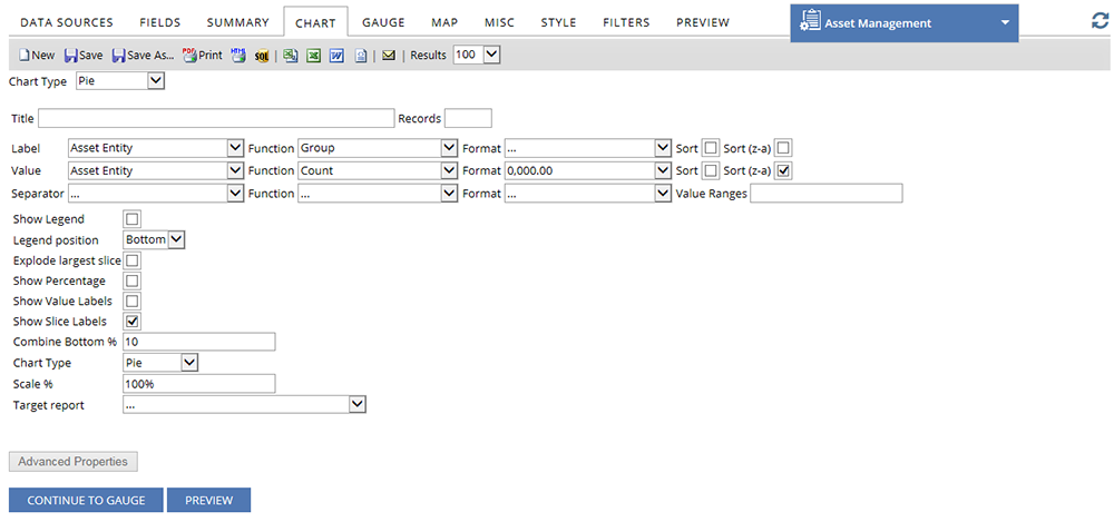
Figure: Pie Chart
The following table describes the fields in the Pie Chart:
| Field | Description |
| Title | Enter a title for the chart. The title is displayed above the chart. |
| Records | Enter the maximum number of records that you want to include in the chart. |
| Label | Select the field that you want to use as the label for the slices of the pie. |
| Value | Select the data metric for the chart. This displays the data for each slice of the pie. |
| Function |
Lists the configured functions that are based on the type of data that you access. From the drop-down list, select the appropriate function. |
| Format |
Lists the configured formats to display the data. From the drop-down list, select the Format in which you want to view the data. |
| Sort | Select the check box to sort the fields from A to Z. |
| Sort (z-a) | Select the check box to sort the fields in descending order. |
|
Advanced Properties |
|
| Separator | Select a field from the drop-down list, to separate the data in multiple charts based on the filed values. |
| Show Legend | Check the check box to display the values given with Separator field, as legends below the chart. The color of the legends are same as the color shown in the Pie chart. |
| Legend position | Select the position of the legends from the drop-down list. You can position the legends to the left, right, bottom or top of the chart. |
| Explode largest slice | Select this check box to separate the largest slice from the chart. |
| Show Percentage | Select this check box to view the percentage value for each slice of the Pie chart. |
| Show Value Labels | Select this check box to view the numeric value for each slice. |
| Show Slice Labels | Select this check box to view the text value for each slice. |
| Combine Bottom % | Enter the percentage in the text box, if you want to combine the slices with less percentage, until they are greater or equal to the percentage you have entered. |
| Chart Type | Select the chart type as per your preference. You can select between Pie or Doughnut. |
| Scale % | Enter the percentage to scale the Pie chart. The size of the chart is displayed as per the percentage that you specify. If you do not specify a percentage, by default, the scale size is selected to 100%. |
| Target Report | Select the subreport from the drop-down list that you want to show on the Pie chart. |
| CONTINUE TO GAUGE | Click the button to access the GAUGE tab. |
| PREVIEW | Click the button to preview the Pie chart that you designed. |

 Funnel
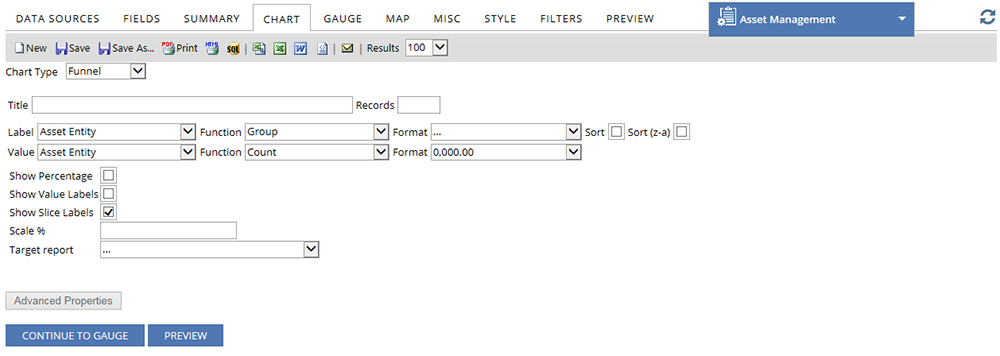
Figure: Funnel Chart
The following table describes the fields in the Funnel Chart:
| Field | Description |
| Title | Enter a title for the chart. The title is displayed above the chart. |
| Records | Enter the maximum number of records that you want to include in the chart. |
| Label | Select the field that you want to use as the label for the slices of the Funnel chart. |
| Value | Select the data metric for the chart. This displays the data for each slice of the Funnel chart. |
| Function |
Lists the configured functions that are based on the type of data that you access. From the drop-down list, select the appropriate function. |
| Format |
Lists the configured formats to display the data. From the drop-down list, select the Format in which you want to view the data. |
| Sort | Select the check box to sort the fields from A to Z. |
| Sort (z-a) | Select the check box to sort the fields in descending order. |
|
Advanced Properties |
|
| Show Percentage | Select this check box to view the percentage value for each slice of the Funnel chart. |
| Show Value Labels | Select this check box to view the numeric value for each slice. |
| Show Slice Labels | Select this check box to view the text value for each slice. |
| Scale % | Enter the percentage to scale the Funnel chart. The size of the chart is displayed as per the percentage that you specify. If you do not specify a percentage, by default, the scale size is selected to 100%. |
| Target Report | Select the subreport from the drop-down list that you want to show on the Funnel chart. |
| CONTINUE TO GAUGE | Click the button to access the GAUGE tab. |
| PREVIEW | Click the button to preview the Funnel chart that you designed. |

 Visualization
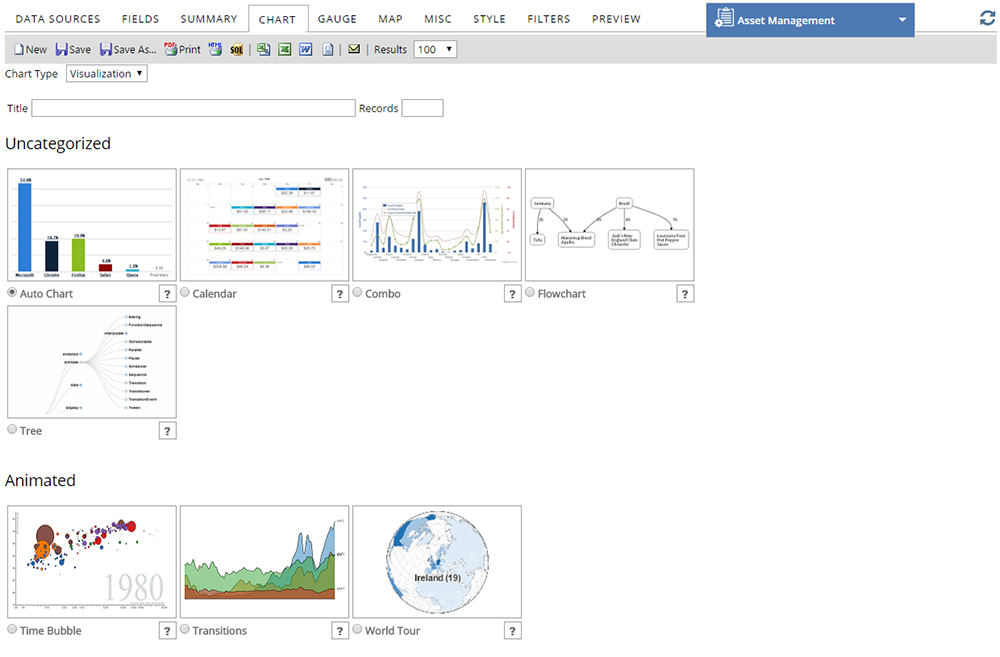
Figure: Visualization Chart
The following table describes the fields on the Visualization Chart:
| Field | Description |
| Title | Enter a title for the chart. The title is displayed above the chart. |
| Records | Enter the maximum number of records that you want to include in the chart. |
| Select Report | From the list of chart templates, select the chart template that you want to add in your report. For more information about the chart templates, click the |
| CONTINUE TO GAUGE | Click the button to access the GAUGE tab. |
| PREVIEW | Click the button to preview the Visualization chart that you designed. |

 GAUGE
GAUGE
Under the GAUGE tab, you can create a list of Gauges and add them to your report.

Figure: GAUGE tab
The following table describes the fields under the GAUGE tab:
| Field | Description | ||||||||||||||||||||||||||
| Report Designer's Toolbar | Enables you to perform various functions on the reports such as, create, save, print, e-mail, export and so on.   See Screen Shot. See Screen Shot.
Figure: Report Designer's Toolbar
The following table describes the icons on the Report Designer's Toolbar.
|
||||||||||||||||||||||||||
| Title | Enter the title for the selected Gauge. | ||||||||||||||||||||||||||
| Results | Select the number of Gauges that you want to display in your report. | ||||||||||||||||||||||||||
| Name | Select the name of the field that is used as the grouping field of the Gauge. | ||||||||||||||||||||||||||
| Value | Select the name of the field that is used as the data points of the Gauge. The values are displayed in numeric numbers. | ||||||||||||||||||||||||||
| Function | Lists the configured functions that are based on the type of data that you access. From the drop-down list, select the appropriate function. | ||||||||||||||||||||||||||
| Format | Lists the configured formats to display the data. From the drop-down list, select the Format in which you want to view the data. | ||||||||||||||||||||||||||
| Sort | Select the name of the field that is used to sort the data. | ||||||||||||||||||||||||||
| Sort (z-a) | Select the check box to sort the data in descending order. | ||||||||||||||||||||||||||
| Minimum | Enter the lower limit of the value that you want to display on the Gauge. | ||||||||||||||||||||||||||
| Maximum | Enter the upper limit of the value that you want to display on the Gauge. | ||||||||||||||||||||||||||
| Color | Enter specific colors or color range for the Value bar. The color selection is applicable to the gauge styles such as, Linear, Radial and Radial 2. | ||||||||||||||||||||||||||
| Gauge Style | Select the Gauge styles that you want to display in your report. The available gauge styles are Linear, Radial, Animated Half Circle, Logarithmic, and Radial 2. | ||||||||||||||||||||||||||
| Show values in currency format | Check the check box to display the values in a currency format. | ||||||||||||||||||||||||||
| Target report | Select the a drill-down report based on the field that you selected in the Name field. | ||||||||||||||||||||||||||
| Effect | Select the effect that you want to set for the Target report. The Effect option enables you to choose, how the target report is displayed on the Gauge. | ||||||||||||||||||||||||||
| CONTINUE TO MAP | Click the button to access the MAP tab. | ||||||||||||||||||||||||||
| PREVIEW | Click the button to get a preview of the Gauge that you designed. |

 MAP
MAP
Under the MAP tab, you can design your report and view the report details on a map.
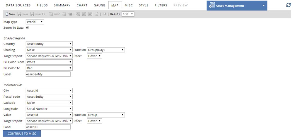
Figure: MAP tab
The following table describes the fields under the MAP tab:
| Field | Description |
| Map Type | Select the Map type on which you want to display your data. The available Map types are World, Europe, USA, and Australia. |
| Zoom To Data | Select the check box to zoom to the location where the data is available. |
| Shaded Region | |
| Country | Select the field where country data is located. |
| Shading | Select the field that you want to use for shading. The field only contains the numeric data. |
| Function | Select the function that you want to use for shading. The field only contains the numeric data. |
| Target report | Select a subreport that you want to use for this map. The drill-down key for the subreport corresponds to the Country field. |
| Effect | Select the effect from the drop-down list. The subreport is displayed on the map based on the effect that you selected. |
| Fill Color From/To | Select the gradient colors for the shaded region. |
| Label | Enter the text that you want to display for the legends. |
| Indicator Bar | |
| City | Select the field where city data is located. Indicator bars are displayed with the data when you point your mouse pointer on the city. |
| Postal code | Select the field where postal code data is located. Indicator bars are displayed with the data when you point your mouse pointer on the postal code. |
| Latitude | Select the field where latitude data is located. |
| Longitude | Select the field where longitude data is located. |
| Value | Select the field that you want to use in the indicator bar. The field only contains the numeric data. |
| Function | Select the function that you want to use in the indicator bar. The field only contains the numeric data. |
| Target report | Select a subreport that you want to use for this map. |
| Effect | Select the effect from the drop-down list. The subreport is displayed on the map based on the effect that you selected. |
| Label | Enter the text that you want to display for the indicator bars. |
| CONTINUE TO MISC | Click the button to access the MISC tab. |

 MISC
MISC
Under the MISC tab, you can add a title, description, header, and footer to the report. You can also create drill-downs and provide share access of the report.
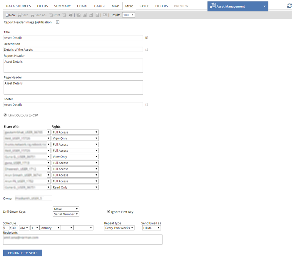
Figure: MISC tab
The following table describes the fields under the MISC tab:
| Field | Description |
| Report Header Image Justification | Select the box to set the alignment of the Report Header image to Left, Middle or Right. |
| Title | Enter the title of the report. |
| Description | Enter the description of the report. |
| Report Header | Enter the Header information of the report. |
| Page Header | Enter the Header information of the page. |
| Footer | Enter the Footer information of the report. |
| Limit Outputs to CSV | Check the check box to limit the outputs to the CSV format. |
| Share With | Select the Users from the drop-down list, with whom you want to share your report. The Share With drop-down allows you to share your report with:
|
| Rights | Select the Access rights for each user from the drop-down list.
The Rights drop-down allows you to provide the Users with different levels of access. The levels of access you can allow are as follows:
|
| Owner | Displays the name of the user who created the report. The field is available for the User with administrator access. |
| Drill-Down keys | Select the drill-down keys using which you want to create a sub-report. A drill-down key is a field which the sub-report looks through, to match values when it is passed a value by some other report. You can either select one drill-down key or both of them. A sub-report with one key set will search through the first drill-down key for a match. A sub-report with both drill-down keys searches through the first field, get the matches and then searches those matches for values in the second drill-down key field. |
| Ignore First Key | Check the check box to ignore the first drill-down key. If you ignore the first drill-down key, a sub-report with the second drill-down key will search through the second field for a match. |
| Schedule | Select the scheduled Date and Time. |
| Repeat type | Select the repeat frequency of the e-mail from the drop-down list. |
| Send Email as | Select the format of the e-mail from the drop-down list. |
| Recipients | Enter the recipients of the e-mail, separated by comma. |
| CONTINUE TO STYLE | Click the button to access the STYLE tab. |

 STYLE
STYLE
Under the STYLE tab, you can customize your reports. You can also change the color of the border, header, rows, items, and so on.
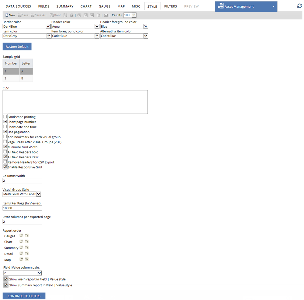
Figure: STYLE tab
The following table describes the fields under the STYLE tab.
| Field | Description |
| Border Color | Select the border color for the grid cells. |
| Header Color | Select the background color of the column headers. If Visual Grouping (VG) is selected for the fields, the color is set for all the column headers in the group. |
| Header foreground color | Select the text color for all the column headers. |
| Item color | Select the background color of the odd numbered report items. |
| Item foreground color | Select the text color for all the report items. |
| Alternating item color | Select the background color of the even numbered report items. |
| Restore Default | Click the button to restore the default settings. |
| Landscape printing | Select the check box to print the report in Landscape mode. |
| Show page number | Select the check box to show page numbers on the printed report. |
| Show date and time | Select the check box to show date and time on the printed report. |
| Use pagination | Select the check box to use pagination in the reports. |
| Add bookmark for each visual group | Select the check box to apply book mark for each visual group. This is applicable to reports exported in PDF format. |
| Page Break after Visual Groups (PDF) | Select the check box to apply the page break, so that each Visual Group gets its own page when the report is exported. |
| Minimize Grid Width | Select the check box to adjust the margins of the grid to match the size of the content. |
| All field headers bold | Select the check box to make the text of all the filter headers, Bold. |
| All field headers italic | Select the check box to make the text of all the filter headers, Italic. |
| Remove Headers for CSV Export | Select the check box to remove the headers when the report is exported in CSV format. |
| Columns Width | Enter the width of the columns in Pixel. |
| Visual Group Style | Select the style of the Visual Group from the drop-down list. |
| Items Per Page (in Viewer) | Enter the number of items that you want to view in each page in the Report Viewer. |
| Pivot columns per exported page | Enter the number of Pivot columns for each page. |
| Report Order | Enables you to reorder the items that are included in the report. |
| Field/Value column pairs | Enables you to set the field value style for multiple columns displaying in one row. |
| Show main report in Field/Value Style | Select the check box if you want to view all the detail grid by using the field value style that is set in the Field/Value column pairs field. |
| Show Summary report in Field/Value Style | Select the check box if you want to view the summary report by using the field value style that is set in the Field/Value column pairs field. |
| CONTINUE TO FILTERS | Click the button to access the FILTERS tab. |

 FILTERS
Under the FILTERS tab, the fields of the data sources that are selected under the DATA SOURCES tab can be filtered so that only relevant data can appear in the final report.

Figure: FILTERS tab
The following table describes the fields under the FILTERS tab:
| Field | Description | ||||||||||||||||||||||||||
| Report Designer's Toolbar | Enables you to perform various functions on the reports, such as create, save, print, e-mail, export, and so on.   See Screen Shot. See Screen Shot.
Figure: Report Designer's Toolbar
The following table describes the icons on the Report Designer's Toolbar.
|
||||||||||||||||||||||||||
| Filter Field | Lists the Data Sources and the fields that are selected under the DATA SOURCES and FIELDS tabs. Select the field that you want to filter from the drop-down list. | ||||||||||||||||||||||||||
| Operator | Lists the filter options that can be applied on the field selected in the Filter Field. Select the operator from the drop-down list. | ||||||||||||||||||||||||||
| Value(s) | Enter a value that matches with the option that you selected in the Operator field. | ||||||||||||||||||||||||||
| Description | Enter the description of the field. | ||||||||||||||||||||||||||
| Blank | Select the check box to view the data that matches with the Filter Field and Value(s) fields or blank or null. | ||||||||||||||||||||||||||
| Param | Check the check box to display the filtered report in the report viewer and to change the filter value in Value(s) field. | ||||||||||||||||||||||||||
 |
Click the Delete icon to remove the selected field. | ||||||||||||||||||||||||||
 |
Click the Insert Field Above icon to insert a new field above the selected field. | ||||||||||||||||||||||||||
 |
Click the Insert Field Below icon to insert a new field below the selected field. | ||||||||||||||||||||||||||
 |
Drag this icon to change the field order. | ||||||||||||||||||||||||||
| Show Filters in Report Description | Select the check box to display the Filters in the Description field of the report when the report is generated or exported. | ||||||||||||||||||||||||||
| Require Parameters in Viewer | Select the number of parameters that you want to view in the report viewer. | ||||||||||||||||||||||||||
| Filter Logic | Enables you to create a custom logic to show the filters in the report. For example, if the logic is set as (1 OR 2) AND (3 OR 4), the results are filtered conditionally based on meeting either Filter 1 or Filter 2 and Filter 3 or Filter 4. By default, the filter logic is set to (1 AND 2 AND 3 AND 4.....n). |
||||||||||||||||||||||||||
| PREVIEW | Click this button to get a preview of the report that you designed. |

 PREVIEW
Under the PREVIEW tab, you can preview the report that you designed. You can also view the charts, summaries, maps, gauges and all other properties that are set by you. You can edit the data under other tabs and preview the modified report under PREVIEW tab.

Figure: PREVIEW tab
| Note: To view the report that you created, see Reports and Dashboard. |
Published on 7th June 2017, v5.5
© 2017 SUMMIT Software Inc. All Rights Reserved.